
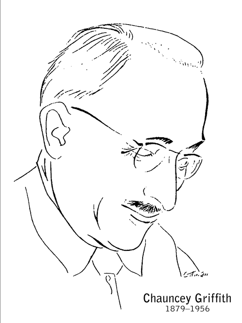
In 1937, Chauncey H. Griffith (1879–1956), then Vice President of Typographic Development at Mergenthaler Linotype, set out to create what, starting with Manhattan's Fall 1937 directory, would be the typeface used in phone books for the next 40 years: Bell Gothic. Bell gothic is a realist sans serif typeface. Bell Gothic consisted of two weights, each serving a different purpose: Bold was used to list subscribers' names and numbers, and Light was used for setting addresses. Beginning in the early 1990s Bell Gothic became popular and associated with avant-garde experimentation with type at places like the Cranbrook Academy of Art, the Design Academy Eindhoven in the Netherlands, and RISD. The typeface was used as a display and caption face by Metropolis magazine, by Canadian graphic designer Bruce Mau in designing the initial ZONE book series, Dutch graphic designer Irma Boom, and has been widely used by Semiotext(e) Books, the MIT Press, and Dia Art Foundation. It was commissioned by AT&T as a proprietary typeface for use in telephone directories. The importance of typography was nothing new to AT&T. In 1894 they had switched from hand set type to the Linotype compositor for their letterpress printing; And by 1915 they had engaged “type experts” who worked with the Linotype company to develop typefaces suited for setting directory information. The typeface was commissioned by AT&T as a proprietary typeface for use in telephone directories. Bell Gothic was superseded by Matthew Carter’s typeface Bell Centennial in 1978, the one-hundredth anniversary of AT&T’s founding. Bell Gothic remained in uninterrupted use for AT&T telephone directories for forty years. Following AT&T’s adoption of Bell Centennial, the Mergenthaler Linotype foundry licensed Bell Gothic for general use. It was designed to be highly legible at small sizes, economical in its use of space, and reproduce well on uncoated, absorbent paper newsprint stock under less than optimal conditions. It’s starting to be seen more and more in corporate identity systems (the company I am employed at included). I’ve seen it used on anything from the new FBI Anti-Piracy label on CDs, to American Express television advertising and collateral.
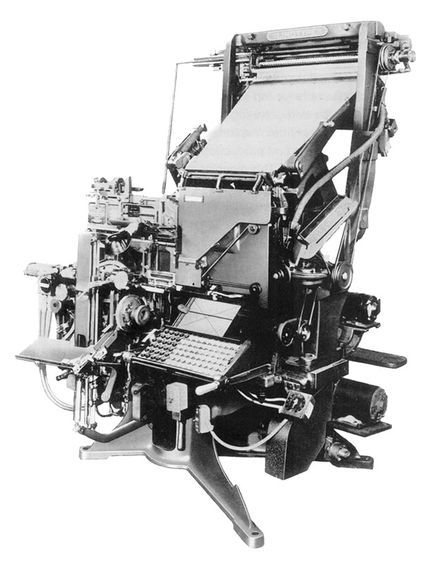
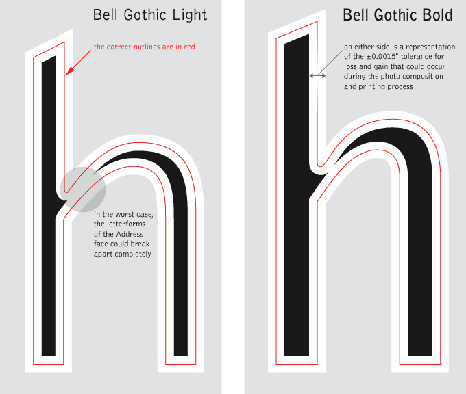
Bell Gothic worked fine when the directories were still being composed in hot metal on a Linotype machine and printed on a letterpress, but because it was designed for those production methods, it didn't hold up under the set of limitations presented by newer technologies. Typographic composition was being done photographically with Cathode Ray Typesetting (CRT), and the printing done on high-speed offset lithography presses. These production methods greatly affected the typeface; letterforms (especially in the Light face) broke apart: its strokes became lighter, sometimes eroding completely at the intersections of straight and curved strokes. For a time, printers tried to compensate for this erosion by over-inking the printing plates; while this helped to thicken the strokes, it brought up a whole new set of problems. Legibility suffered as the already condensed letterforms closed in on themselves. The strokes of different characters ran into each other, making c and l become d; r and n became m; 3 looked like 8; 5 looked like 6. Another problem with over-inking was that the presses had to be stopped frequently for additional cleaning which cost printing time and production money. It was apparent that a new typeface had to be designed to work with the newer technologies instead of trying to force Bell Gothic to work under circumstances for which it was not designed.
No comments:
Post a Comment