fall break.2009.great bend.ks

Wednesday, December 15, 2010

illumination finals

mary cassatt

edgar degas

wassily kandinsky


Project Four: Illuminated Letters: Contemporary Counterpart
An illumination is an embellishment, or additional decoration that enhances the pages of a written, or manuscript page. The decorated pages made it easy for missionaries to find the beginning of a particular section. 
After understanding the history of the illumniated letter you will be explore the contemporary counterpart. Create a series (3) of illuminated letters based on the visual language of an artist(s), designer(s), architect(s) of your choosing. 


Project Overview: This was a great project to end the semester. This process went way faster than previous projects which wasn't the greatest. But I did enjoy picking my favorite artists and "mimicing" their techniques and artwork. I think it would have been fun to do this project by hand versus the final illuminations being digital. 


sketches


Sunday, November 21, 2010

Illuminated Letter

what is an illuminations?
-an embellishment or additional decoration that enhances the pages of a written or manuscript page

-this term illumination comes from the term Illuminate, or to fill with light. This effect is achieved with the application of gold leaf to the letters and images, which reflect light and appear to glow.

-An illuminated letter was usually the first letter of a page or paragraph.
-It was always enlarge and in color with gold applied in areas, while the rest of the text remained black.

-The images used to enhance the letters include animals, plants, and mythological creatures...these images were modified to fit into or around the letter, or in some cases took on the shape of the letter itself.


history:

illuminations were ordered by kings and religious leaders to be added to various pages in order to add interest and importance to their appearance. recording of historical events was such an important task.

the egyptians were the first culture known to document events by use of Illuminated Manuscripts.

illuminations defined a time in history when the ability to read was sacred and reserved for religious leaders or those born of royal blood.

it was a great skill to create such items of beauty and these creations were important, it was a great time in history for artists.


3 Inspirational Artists
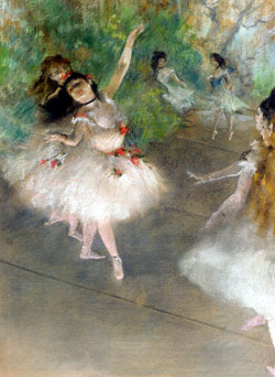


Degas
(Edgar Degas 1834-1917)
-born in Paris, France
-french painter, sculptor & printmaker who was prominent in the impressionist group
-his principal subject was the human--especially the female figure
-Degas is said to have influenced Picasso, Matisse...


Annie Leibovitz
(1949-)
-photographer
-born in Connecticut, one of six children
-influential work with Rolling Stone cover photography (decided on constant white background)
-also works with Vanity Fair magazine
-controversial work


Kandinsky
(Wassily Kandinsky 1866-1944)
-born in Moscow
-played musical instruments at an early age; the influence of music in his paintings cannot be overstated
-he enjoyed success not only as a teacher but also wrote extensively on spirituality, a subject that remained a great interest and ultimately exerted substantial influence in his work
-his work moved in a direction much greater than abstraction which was pioneered by the Impressionists.

Monday, October 11, 2010


Stacy Benson -Self Portrait

ABOUT: bell gothic


In 1937, Chauncey H. Griffith (1879–1956), then Vice President of Typographic Development at Mergenthaler Linotype, set out to create what, starting with Manhattan's Fall 1937 directory, would be the typeface used in phone books for the next 40 years: Bell Gothic. Bell gothic is a realist sans serif typeface. Bell Gothic consisted of two weights, each serving a different purpose: Bold was used to list subscribers' names and numbers, and Light was used for setting addresses. Beginning in the early 1990s Bell Gothic became popular and associated with avant-garde experimentation with type at places like the Cranbrook Academy of Art, the Design Academy Eindhoven in the Netherlands, and RISD. The typeface was used as a display and caption face by Metropolis magazine, by Canadian graphic designer Bruce Mau in designing the initial ZONE book series, Dutch graphic designer Irma Boom, and has been widely used by Semiotext(e) Books, the MIT Press, and Dia Art Foundation. It was commissioned by AT&T as a proprietary typeface for use in telephone directories. The importance of typography was nothing new to AT&T. In 1894 they had switched from hand set type to the Linotype compositor for their letterpress printing; And by 1915 they had engaged “type experts” who worked with the Linotype company to develop typefaces suited for setting directory information. The typeface was commissioned by AT&T as a proprietary typeface for use in telephone directories. Bell Gothic was superseded by Matthew Carter’s typeface Bell Centennial in 1978, the one-hundredth anniversary of AT&T’s founding. Bell Gothic remained in uninterrupted use for AT&T telephone directories for forty years. Following AT&T’s adoption of Bell Centennial, the Mergenthaler Linotype foundry licensed Bell Gothic for general use. It was designed to be highly legible at small sizes, economical in its use of space, and reproduce well on uncoated, absorbent paper newsprint stock under less than optimal conditions. It’s starting to be seen more and more in corporate identity systems (the company I am employed at included). I’ve seen it used on anything from the new FBI Anti-Piracy label on CDs, to American Express television advertising and collateral.
Bell Gothic worked fine when the directories were still being composed in hot metal on a Linotype machine and printed on a letterpress, but because it was designed for those production methods, it didn't hold up under the set of limitations presented by newer technologies. Typographic composition was being done photographically with Cathode Ray Typesetting (CRT), and the printing done on high-speed offset lithography presses. These production methods greatly affected the typeface; letterforms (especially in the Light face) broke apart: its strokes became lighter, sometimes eroding completely at the intersections of straight and curved strokes. For a time, printers tried to compensate for this erosion by over-inking the printing plates; while this helped to thicken the strokes, it brought up a whole new set of problems. Legibility suffered as the already condensed letterforms closed in on themselves. The strokes of different characters ran into each other, making c and l become d; r and n became m; 3 looked like 8; 5 looked like 6. Another problem with over-inking was that the presses had to be stopped frequently for additional cleaning which cost printing time and production money. It was apparent that a new typeface had to be designed to work with the newer technologies instead of trying to force Bell Gothic to work under circumstances for which it was not designed.


Friday, October 8, 2010

Saturday, September 18, 2010

http://www.youtube.com/watch?v=9MoxKXEBRC8

adrian frutiger & UNIVERS

~type designer
~has produced some of the most well known and widely used typefaces
~native of Switzerland: born 1928
~began as an print apprentice at the age of 16
~continued his studies at the Zurich School of Arts and Crafts 


"Alfred Williman’s theory was: Do not apply black but cover up white, so as to make the light of the white sheet active"

~has produced a number of books:
Type, Sign, Symbol (1980)
Signs and Symbols: Their Design and Meaning (1989)
The International Type Book (1990)
Geometry of Feelings (1998)
The Development of Western Type Carved in Wood Plates (1999)
Forms and Counterforms (1999)
Life Cycle (1999)
The Univers (1999)
Symbols and Signs: Explorations (1999)

~types of adrian frutiger:
President
Phoebus
Ondine
Meriiden
Egyptienne
Univers
Apollo
Serifa
OCR-B
Iridium
Frutiger
Glypha
Icone
Breughel
Versailles
Avenir
Vectora


Sources:

"Adrian Frutiger." Wikipedia. 06 May 2005 -http://en.wikipedia.org/wiki/Adrian_Frutiger.
"Frutiger." Wikipedia. 06 May 2005 -http://en.wikipedia.org/wiki/Frutiger.
Kunz, Willi. Typography: Macro + Microaesthetics. Zurich, Switzerland: Verlag Niggli, 1998. 22-23.
Linotype. 06 May 2005 - http://www.linotype.com.
Müller-Brockmann, Josef. Grid Systems In Graphic Design. Zurich, Switzerland: Verlag Niggli, 1996. 22.
"Univers." Wikipedia. 06 May 2005http://en.wikipedia.org/wiki/Univers.


Wednesday, September 1, 2010

typography.august 30 2010

alphabet variation definitions:


weight-- the overall thickness
width-- how wide the letter is in typeface compared to its height
style--  serif or san serif


measuring type definitions:


point-- unit to measure type
pica-- measurement in print making; 6 picas =1 inch


-there are 72 points in an inch ; this means there are 12 points in a pica


                     If a letter is set in 36 pts it will be .5 inches.


x-height -- distance between the baseline and the middle of the type


cap height -- this is the height of capital letters above the baseline


leading -- this is the space between lines of type

Wednesday, August 25, 2010

interesting poem i explored today... written by weldon kees

For My Daughter


Looking into my daughter's eyes I read
Beneath the innocence of morning flesh
Concealed, hintings of death she does not heed. 
Coldest of winds have blown this hair, and mesh
Of seaweed snarled these miniatures of hands;
The night's slow poison, tolerant and bland,
Has moved her blood. Parched years that I have seen
That may be hers appear: foul, lingering
Death in certain war, the slim legs green.
Or, fed on hate, she relishes the sting
Of others' agony; perhaps the cruel
Bride of a syphilitic or a fool.
These speculations sour in the sun.
I have no daughter. I desire none.

Tuesday, August 24, 2010

monday august 23. hw

grid = is a layout of equally spaced horizontal and vertical lines 


designers use the grid to place objects, type, and other designs in equal spacing and proportion or just for organization of a composition or design. 


“ The grid system is an aid, not a guarantee.
It permits a number of possible uses and each
designer can look for a solution appropriate to his
personal style. But one must learn how to use the
grid; it is an art that requires practice. ”
Josef Müller-Brockmann  


modular grid = a column grid with even more horizontal flow lines which divide the the columns into rows which creates the modules


    margins = define the active space of a picture plane


      columns = vertical columns


    grid modules = the areas created by the margins, columns and flow lines 


      flow lines = the horizontal rows


    gutter = the blank space which separates the rows and columns 


hierarchy = rank = order of importance


typographic color = the overall density that can be based on the type face, size, and spacing


  hierarchy can be achieved by:

  • composition-placement on picture plane
  • size - as compared to other objects
  • color
  • weight
  • style